START PAGE | HOMEPAGE | NEWS | SPORT | WEATHER | FACEBOOK | XING | LINKEDIN | VIDEO CHANNEL | PHOTO GALLERY | CONTACT | SEARCH |
||||||||||||||||||||||||||||||||||||||||||||||||||||||||||||||||||||||||||||||||||||||||||||||||||||||||||||||||||||||||||||||||||||||||||||||||||||||||||||||||||||||||||||||||||||||||||||||||||||||||||||||||||||||||||||||||||||||||||||||||||||||||||||||||||||||||||||||||||||||||||||||||||||||||||||||||||||||||||||||||||||||||||||||||||||||||||||
|
||||||||||||||||||||||||||||||||||||||||||||||||||||||||||||||||||||||||||||||||||||||||||||||||||||||||||||||||||||||||||||||||||||||||||||||||||||||||||||||||||||||||||||||||||||||||||||||||||||||||||||||||||||||||||||||||||||||||||||||||||||||||||||||||||||||||||||||||||||||||||||||||||||||||||||||||||||||||||||||||||||||||||||||||||||||||||||
|---|---|---|---|---|---|---|---|---|---|---|---|---|---|---|---|---|---|---|---|---|---|---|---|---|---|---|---|---|---|---|---|---|---|---|---|---|---|---|---|---|---|---|---|---|---|---|---|---|---|---|---|---|---|---|---|---|---|---|---|---|---|---|---|---|---|---|---|---|---|---|---|---|---|---|---|---|---|---|---|---|---|---|---|---|---|---|---|---|---|---|---|---|---|---|---|---|---|---|---|---|---|---|---|---|---|---|---|---|---|---|---|---|---|---|---|---|---|---|---|---|---|---|---|---|---|---|---|---|---|---|---|---|---|---|---|---|---|---|---|---|---|---|---|---|---|---|---|---|---|---|---|---|---|---|---|---|---|---|---|---|---|---|---|---|---|---|---|---|---|---|---|---|---|---|---|---|---|---|---|---|---|---|---|---|---|---|---|---|---|---|---|---|---|---|---|---|---|---|---|---|---|---|---|---|---|---|---|---|---|---|---|---|---|---|---|---|---|---|---|---|---|---|---|---|---|---|---|---|---|---|---|---|---|---|---|---|---|---|---|---|---|---|---|---|---|---|---|---|---|---|---|---|---|---|---|---|---|---|---|---|---|---|---|---|---|---|---|---|---|---|---|---|---|---|---|---|---|---|---|---|---|---|---|---|---|---|---|---|---|---|---|---|---|---|---|---|---|---|---|---|---|---|---|---|---|---|---|---|---|---|---|---|---|---|---|---|---|---|---|---|---|---|---|---|---|---|---|---|---|---|---|---|---|---|---|---|---|---|---|---|---|---|---|---|---|---|---|---|
|
|
|||||||||||||||||||||||||||||||||||||||||||||||||||||||||||||||||||||||||||||||||||||||||||||||||||||||||||||||||||||||||||||||||||||||||||||||||||||||||||||||||||||||||||||||||||||||||||||||||||||||||||||||||||||||||||||||||||||||||||||||||||||||||||||||||||||||||||||||||||||||||||||||||||||||||||||||||||||||||||||||||||||||||||||||||||||||||||
Here are 12 great tips and tricks from professional web designers: Text from BRIDFAS website - click on the logo on the left (centre) The British Decorative and Fine Arts Society of Hamburg e.V. (BRIDFAS) was founded in 1987 to stimulate interest in the decorative and fine arts, to cultivate their appreciation and study and to promote a greater awareness of our international cultural heritage BRIDFAS provides, for its members, a yearly programme of illustrated lectures, given in English, by lecturers from the U.K. chosen for their communication skills and expert knowledge of their fields. Study days are held where subjects can be examined in more depth. Click on the graphic for more
Hamburg English Pages
![]()
Abstract + Creation
Culture, design, photography, architecture, interior design, art, museums, galleries


being rebuilt as a major concert location
![]() Hamburg What's On - see Out & About page for more
Hamburg What's On - see Out & About page for more
History: Buddenbrook House in Luebeck - well worth a visit - displays in English (the last time we looked - 2002)
Luebeck's Museums - Also, visit Lübeck early December for the best Christmas markets in a wonderful setting - Don't miss this café > Click here - select English version and then Café
Search for "Hamburg Art"
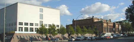
Above - Hamburg Art Museum - Click for details in English - Next to main train station
Tip: As we have all found out to our dismay, all the shops are closed on Sundays in Germany! If you are looking for a good present for a birthday etc, visit the Museum's book shop on a Sunday. The post office, just round the corner in the main train station is also open. So if you forget during the week, or you don't have time, you can also go there or use the shops in the Wandelhalle in the station - includes flower shops, stationary, limited and expensive food shopping and book shops plus the Body Shop - all open Sunday

Past Events
Hamburg's Annual "British Day" - 7 Page Photo Gallery - Hamburg English Pages Special Feature
![]() Hamburg Photography Index
Hamburg Photography Index
Photos of Hamburg - external Website - more on the right >>>
Photos below: Hamburg English Pages, unless stated - all rights reserved. Full size photo prices, on CD, as an E-Mail or as prints, on request. Photography, retouching service, digital photo-albums and more by request - please send us an E-Mail or call today. Photos in Video format, or for Real Player, PowerPoint and Quicktime etc. Details available
![]()
Slide show index
1. Elvis spotted in Hamburg outside Versace in 2002
2. Hamburg Harbour - twice
3. Life around the Alster
4. Flags on the white sand river beaches below Hamburg-Blankenese
5. A shopping arcade in Hamburg city centre
6. A Hamburg City centre canal
Free DHTML scripts provided by Dynamic Drive
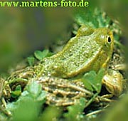
www.martens-foto.de - Photo Website Tip
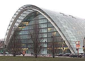
Berliner Bogen - March 2004
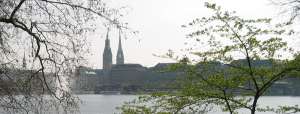
Spring 2002 in Hamburg
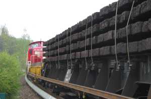
Work on the Klein Flottbek S-Bahn train station removing the old..
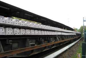
Bringing the new
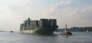
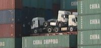
A Chinese container ship on the Elbe
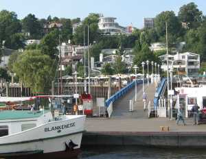
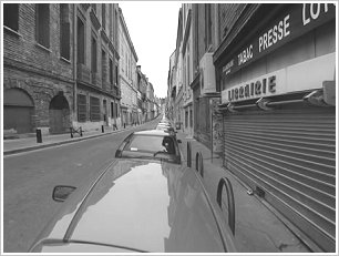
Hamburg-Oevelgoenne - Museum Harbour with a number of cafés
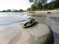
Signs of times gone by - Hamburg-Falkenstein beach
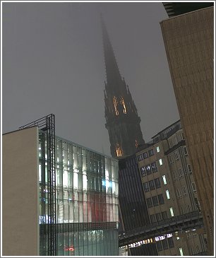
![]() Photo Art
Photo Art
On the Alster
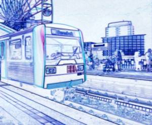
U3-Train Art - Photo taken in Hamburg harbour during the Harbour birthday celebrations - May 2002
![]()
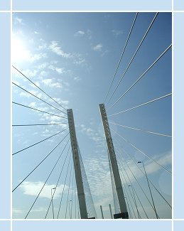
![]() Abstract & Creation
Abstract & Creation

![]() Design
Design
![]() Web Design
Web Design
Professional Web Design Tips & Tricks
1. Put Important Information Near the Top
Organize your pages from the top down. Important info should be easy to find.
2. Limit Length of Pages
Two or three screens should be the maximum length of any page, unless unavoidable.
3. Make Navigation Simple
Be consistent in your placement of navigational tool, i.e. menus, buttons, etc.
4. Make Images As Small As Possible
Reduce physical size of images in Paint/Photo programme before placing in your web page.
5. Use Web Palette (216 colours)
This keeps files small and makes images look good on all monitors and systems.
6. Use GIF and JPEG Properly
Use JPEG for photos and GIF for everything else.
7. Avoid Busy Backgrounds
Text should be easy to read. Make sure you have enough contrast.
8. Use ALT Parameter (low-res and/or text) for Images
This is important for people viewing your pages with older computers.
9. Avoid Excessive Animation
Don't animate images unless you have a good reason - it can be very irritating.
2003 Update: A Rainbow of Colour Choices - When deciding on what colour to use, there are a variety of influences that you should keep in mind, by Eileen E. Flynn
![]() Exhibitions
Exhibitions
Please let us know
![]() Art Auctions
Art Auctions
Please let us know
![]() Art & Arts - Features, News, Photos, Links & More
Art & Arts - Features, News, Photos, Links & More
Shakespearean text lives online - Scholars can see how the text changes across editions...
Fans of Shakespeare are getting the chance to thumb through some of the earliest copies of the Bard's plays - BBC News - British Library Website with the text
The First Art Newspaper on the Net - includes lists of Galleries in Germany & the World
The major modern & contemporary visual artists the-artists.org
Google Artists Directory
![]()
Art News: Google search
UK National Portrait Gallery
The Gaurdian UK Arts Page
The Scotsman Photogallery
Send an Art E-card
Art News: News from the World's leading art museums
![]() Architecture add your suggestions - updated December 2009
Architecture add your suggestions - updated December 2009
Search
Your tip / website can be sent here
Deichstrasse
Attractions
![]() Top
Top
![]()
![]()
Links Index
Art Museums
Galleries
Online Art
Photo Links Hamburg
Free Photo Links
Design
Contact
![]()
![]() Hamburg Museums
Hamburg Museums
Museum of Art & Trade
All Hamburg Museums English
Hamburg Museum of Art
![]() Galleries
Galleries
UK National Portrait Gallery
Send an Art E-card
Hamburg Gallery
Galleries in Hamburg
![]() Online Art
Online Art
Artcyclopedia
![]() Photo Links Hamburg
Photo Links Hamburg
Photos of Germany
Hamburg Photo Archive
Hamburg: List of Sights
Hamburg Photos
Hamburg Photos US Site
![]() Free Photos
Free Photos
Click > 01 - 02 - 03 - 04
![]()